Malayan Railways
ROLE
// UX Designer
// UX Researcher
Malayan Railway is a train operator in Malaysia. They serve Malaysians and Singaporeans entering Malaysia.
Singaporeans traveling over to Johor Bahru contribute significantly to Malaysian tourism and this is an opportunity to encourage more travelers to come.
BACKGROUND
CHALLENGE
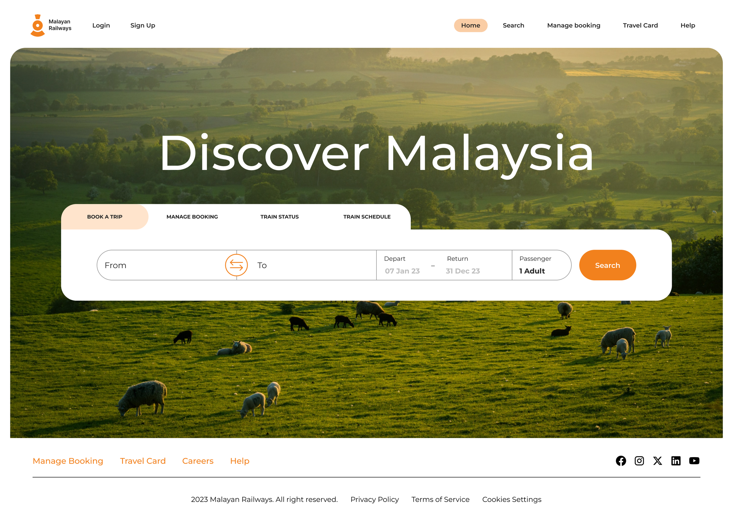
Redesign the Malayan Railways website to increase usage by travelers.
A BRIEF OBSERVATION
The current website is hard to navigate and discourages travellers to book tickets as it can be quite frustrating to use. There is no sensible flow for users to navigate to the correct pages.


PROBLEM STATEMENT
Travelers need an easier way to search and book train tickets as the current website is hard to navigate and frustrating to use.
Research
To learn what is the experience of booking a train on the current website and understand the frustrations of travellers.
GOALS

USER INTERVIEWS
To get to know the user’s experience, I conducted 5 in-person interviews.
The questions provided a framework for our research, competitive analysis, and user testing. I asked the participants questions such as:
How often do you travel to Johor Bahru (JB)?
How do you travel there usually?
What is your top consideration when choosing your mode of transport into JB?
What is the biggest inconvenience when traveling into JB?
Can you show me how you would book a train ticket on the site?
If this website isn’t good, what are some better examples of a booking site?
What improvements would you like to see on the website?
Synthesising the research…
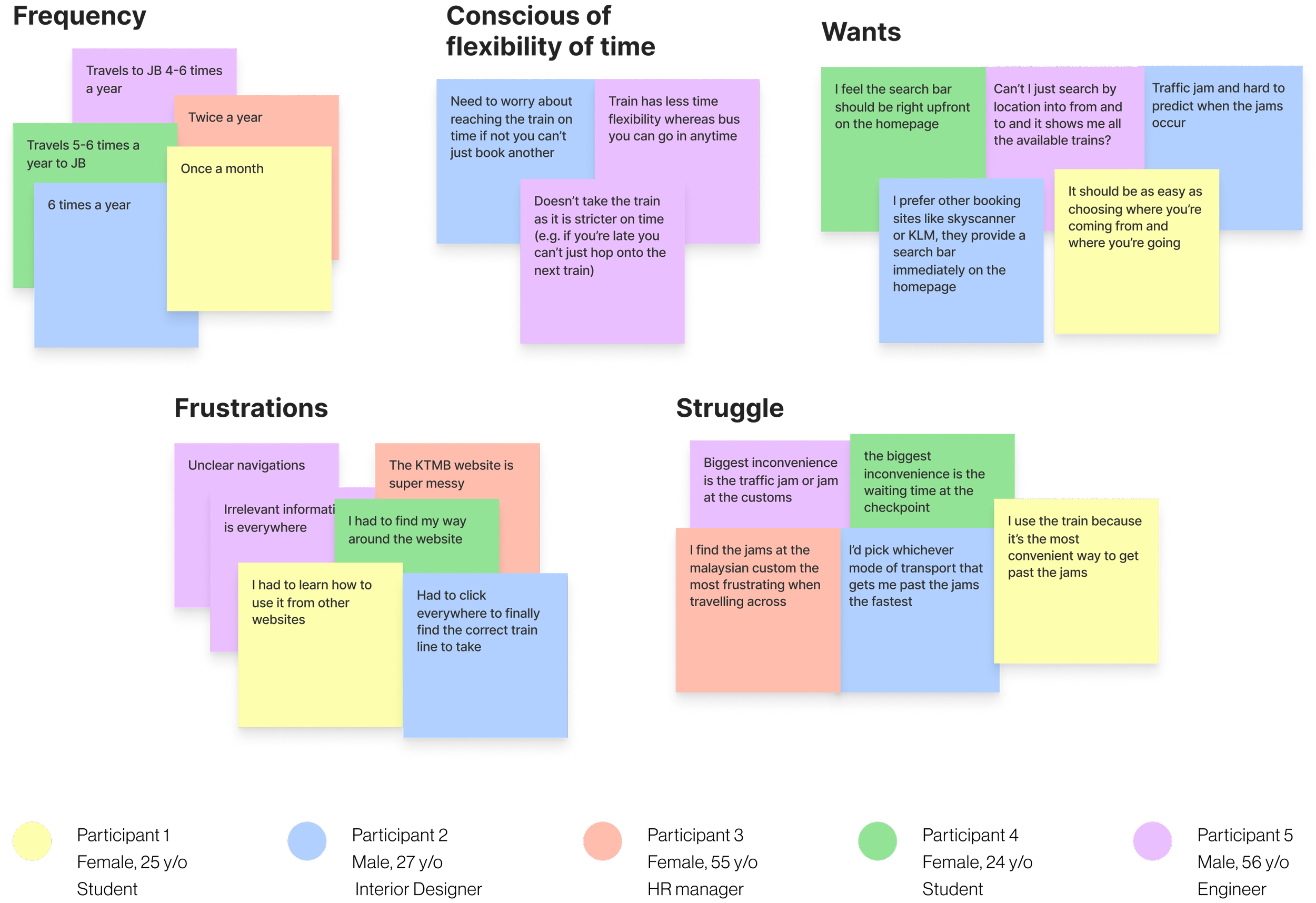
AFFINITY MAP
KEY PAINPOINTS
01
Confusing train search
“It should be as easy as choosing where you’re coming from and where you’re going.”
USER PERSONA
02
Difficult to navigate
“I had to learn how to use it from other websites.”
03
Cluttered Homepage
“Irrelevant information is everywhere.”, “The KTMB website is super messy.”

Before I jumped into the design of the website it was important for me to visualise the tasks users would take and the way they would go about them.
TASK FLOW
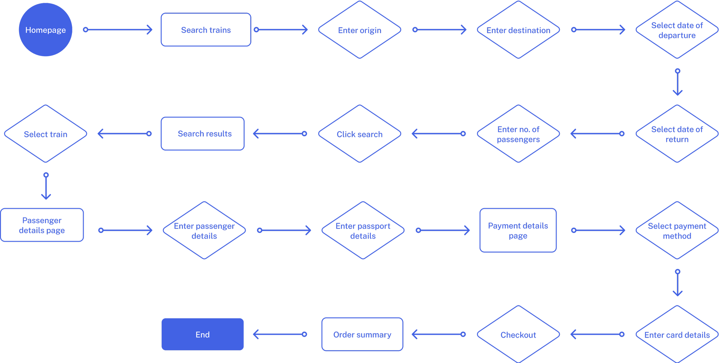
USER FLOW

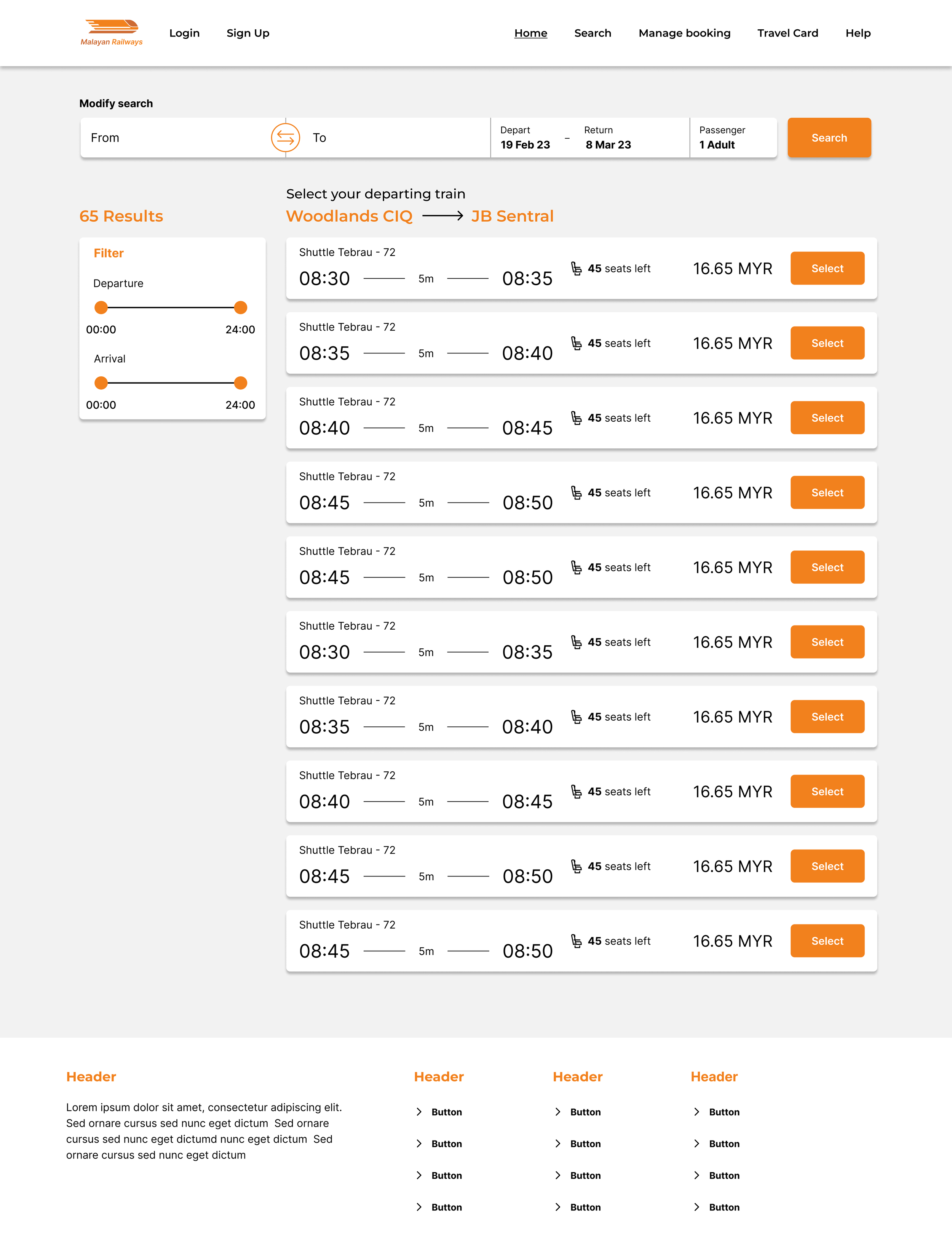
Initial Wireframes
WIREFRAMES

PROTOTYPE 1


User Testing
To test the overall quality and ease of use of the website I provided 4 tasks based on different scenarios for participants to attempt.
You are going to JB how would you book a train ticket to get there?
The user test showed me where the current design is lacking. I went back to iterate and address the confusion that users faced while using my prototype.
Also, I felt that I could do better with the UI Design
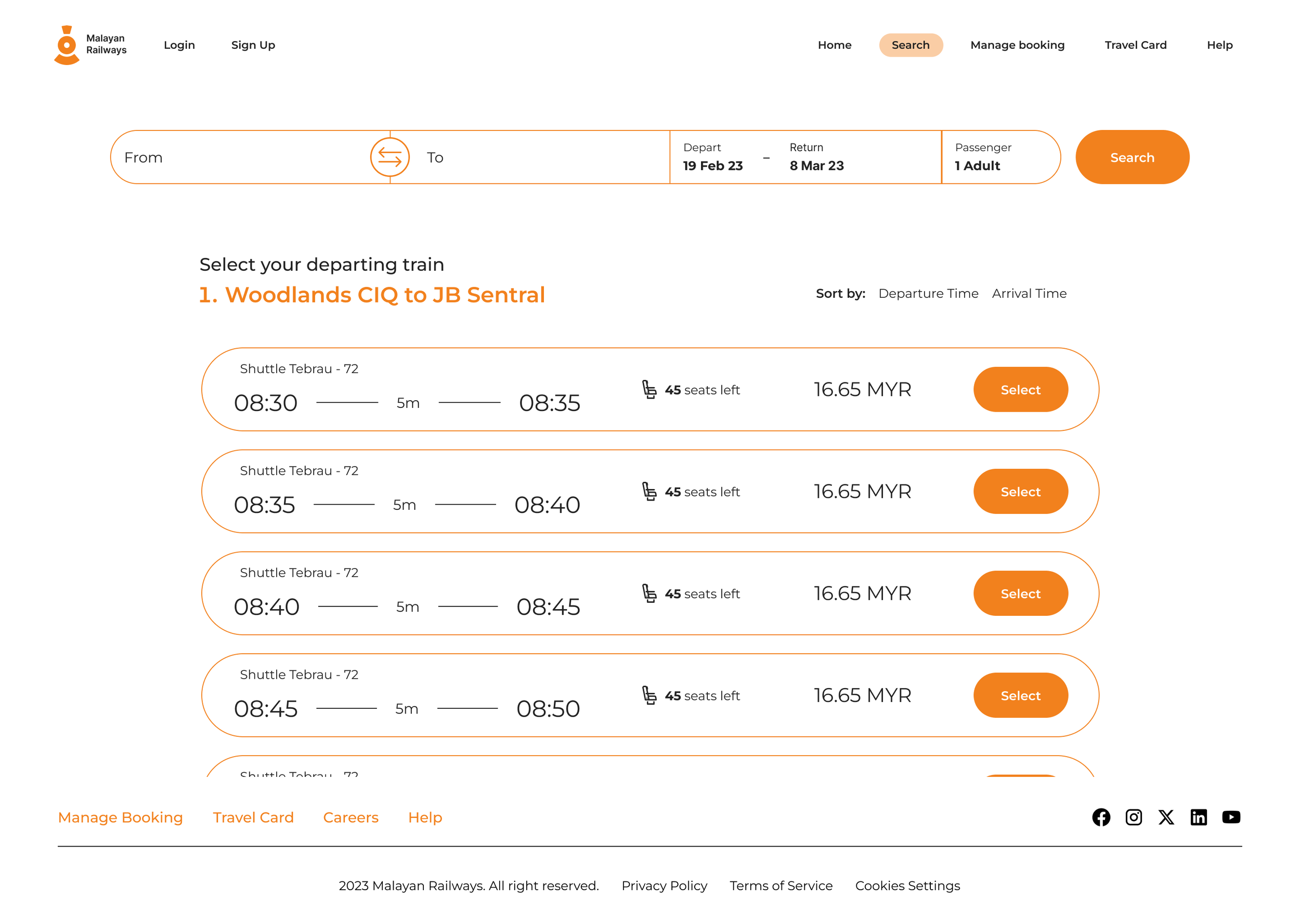
ITERATION 1
Provide clear visual indication that user has already selected their first ticket
Before
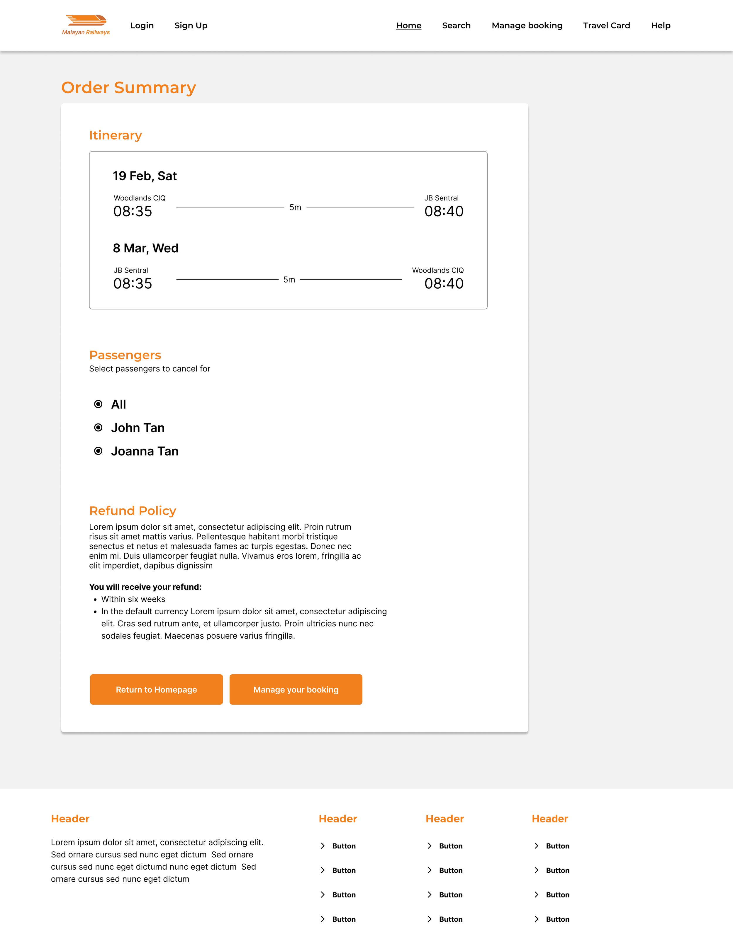
How would you cancel your train booking?
“I didn’t realise that I was already at the second ticket selection because it didn’t look like anything changed after I clicked on ‘select’ for my departure ticket.”
You realised that you booked the wrong ticket timing, how would you change your ticket?
You want to suggest possible times to your friends for a trip to JB, how would you do it?

After
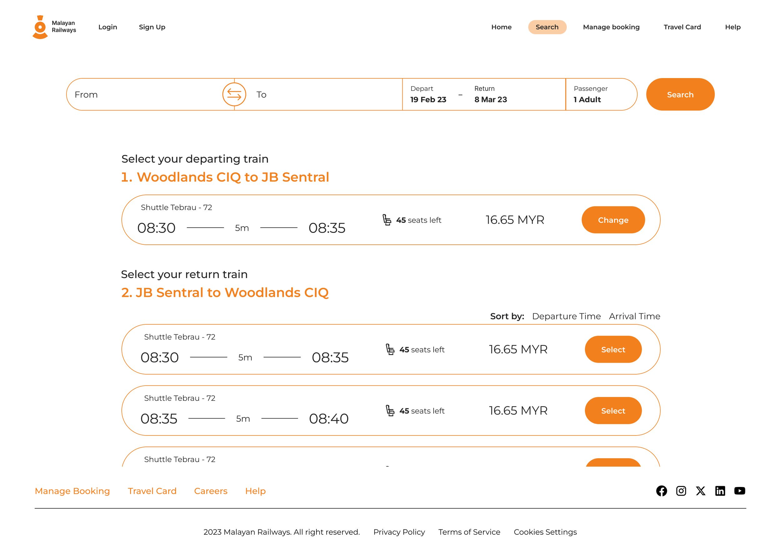
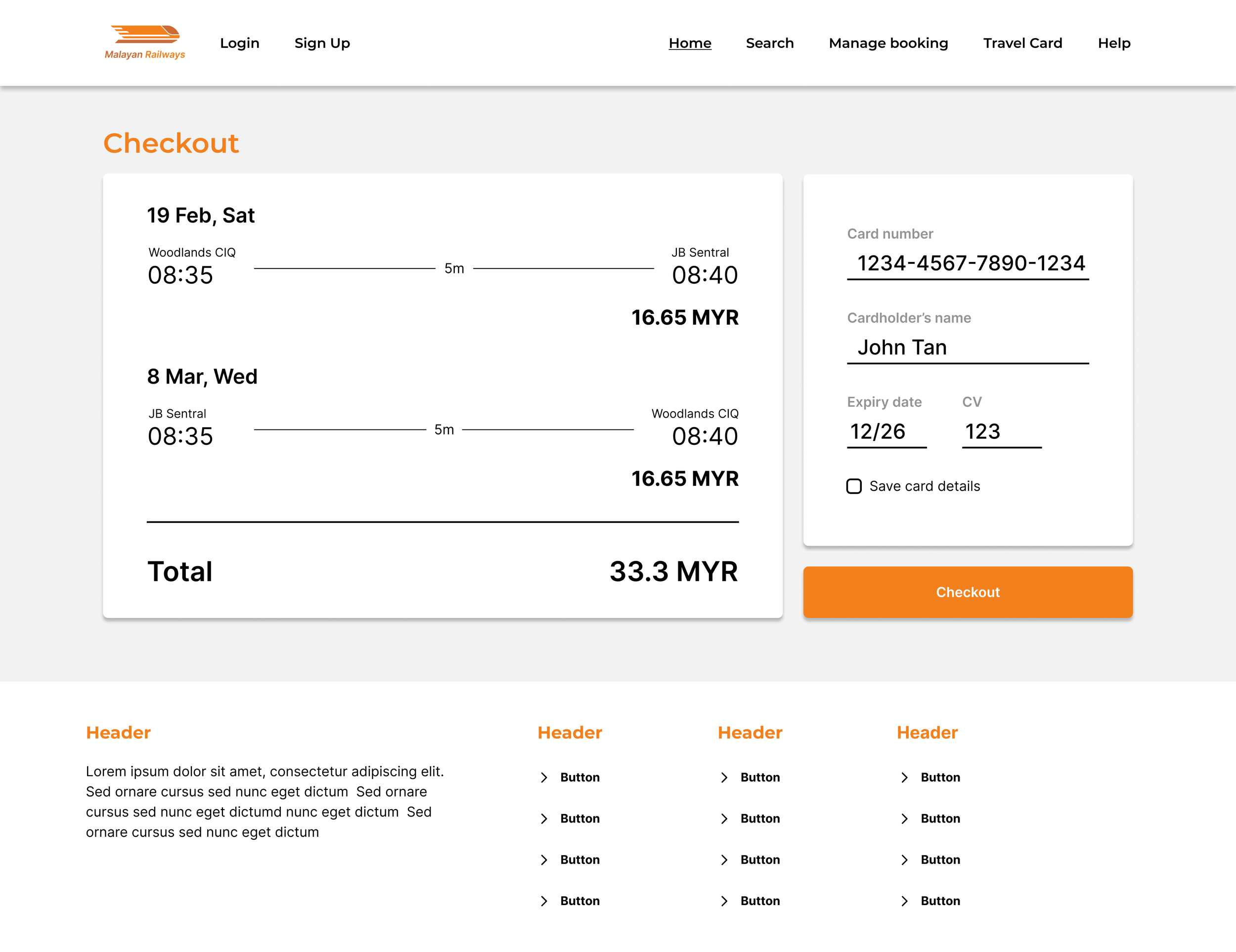
Outbound and inbound ticket selection is done on one page.
Upon clicking on a booking, it collapses to indicate selection
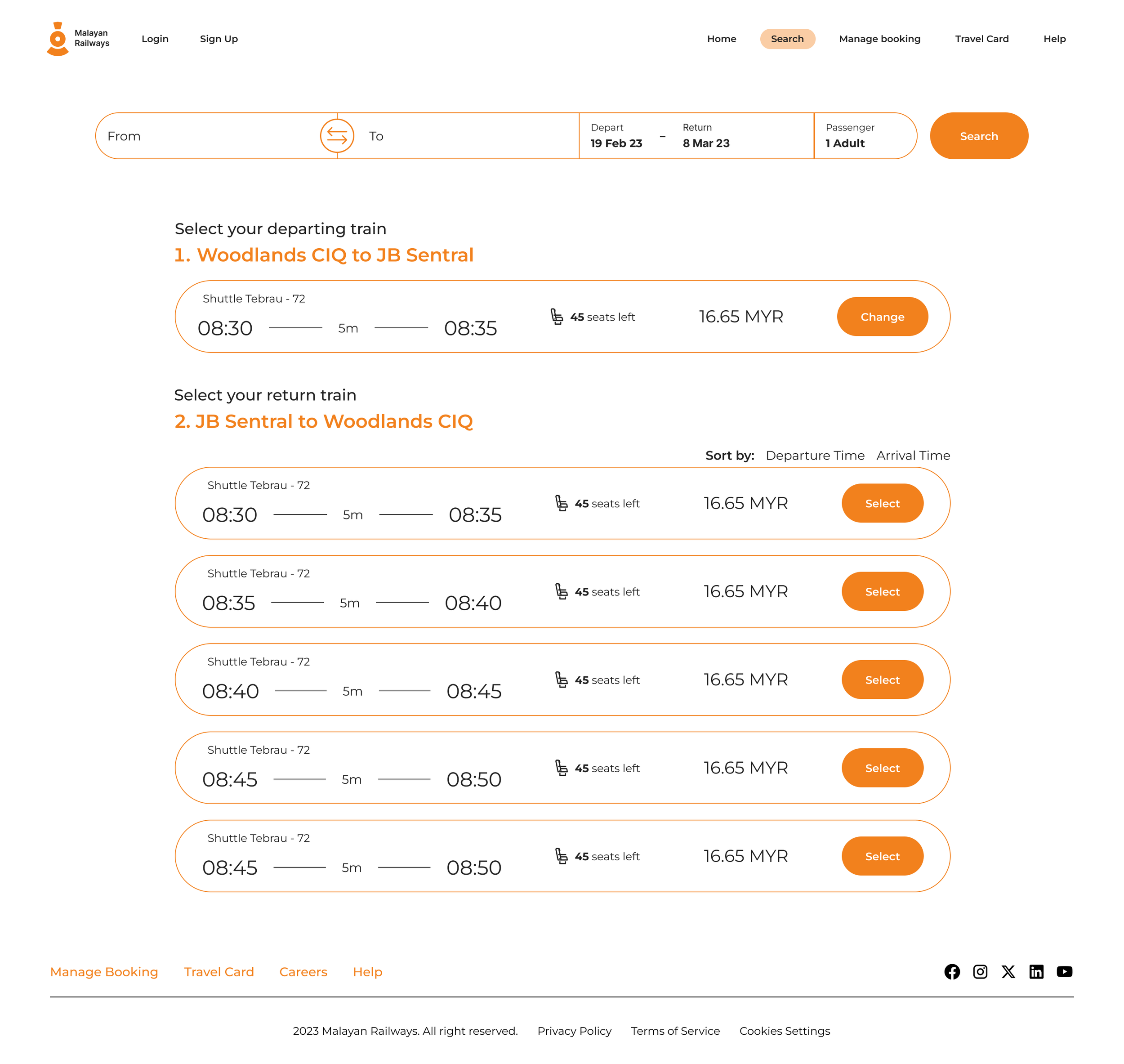
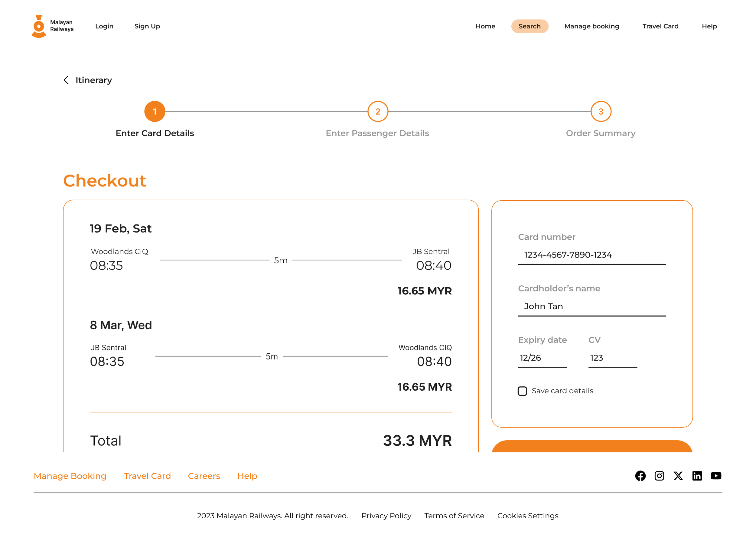
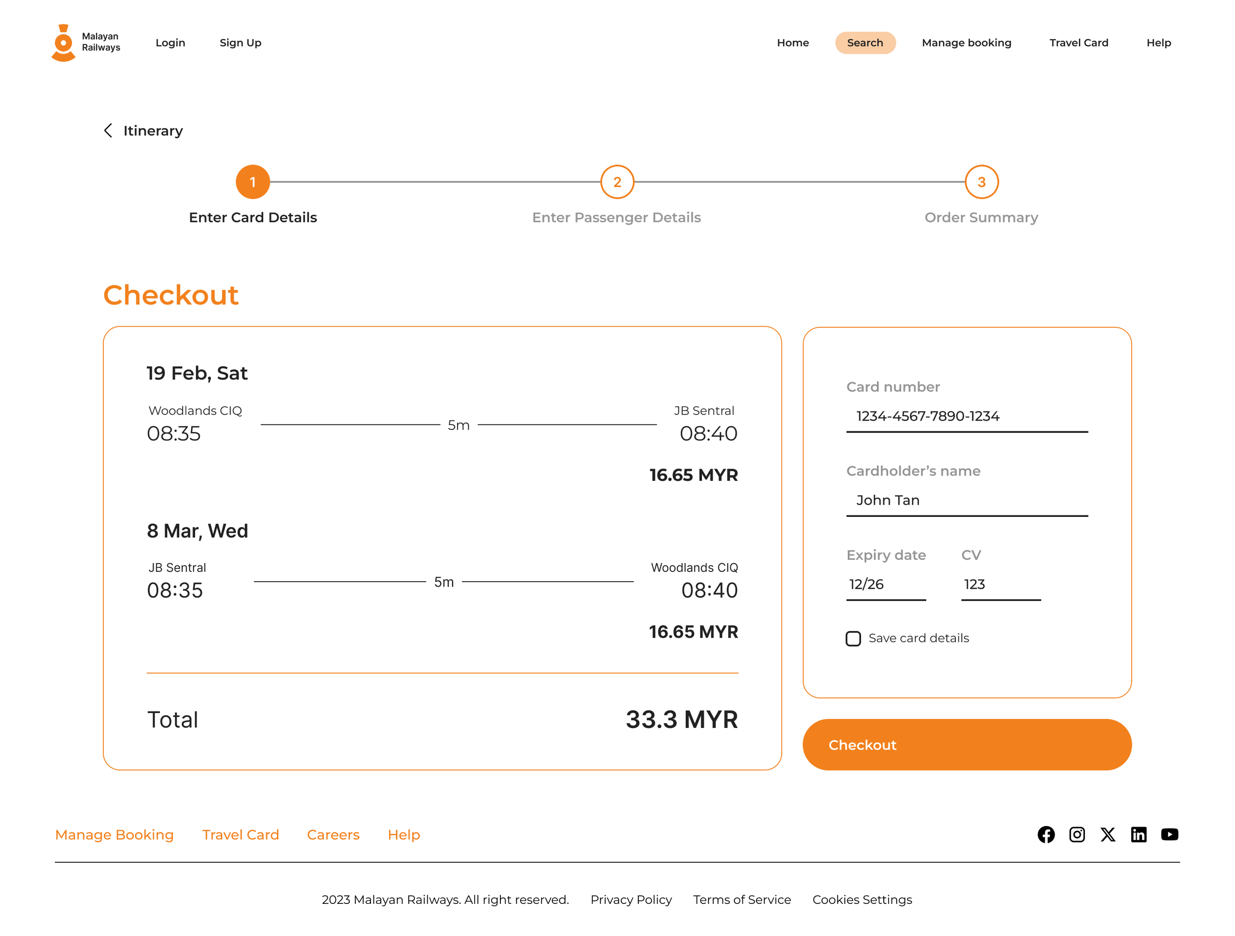
ITERATION 2
Increase ease of navigating between stages in the checkout process
Before
“There should be a back button at the passenger details page.”
“A progress bar would help to show where I’m at during the checkout process”
After
Included a progress bar and placed back buttons
for easy navigation.
ITERATION 3
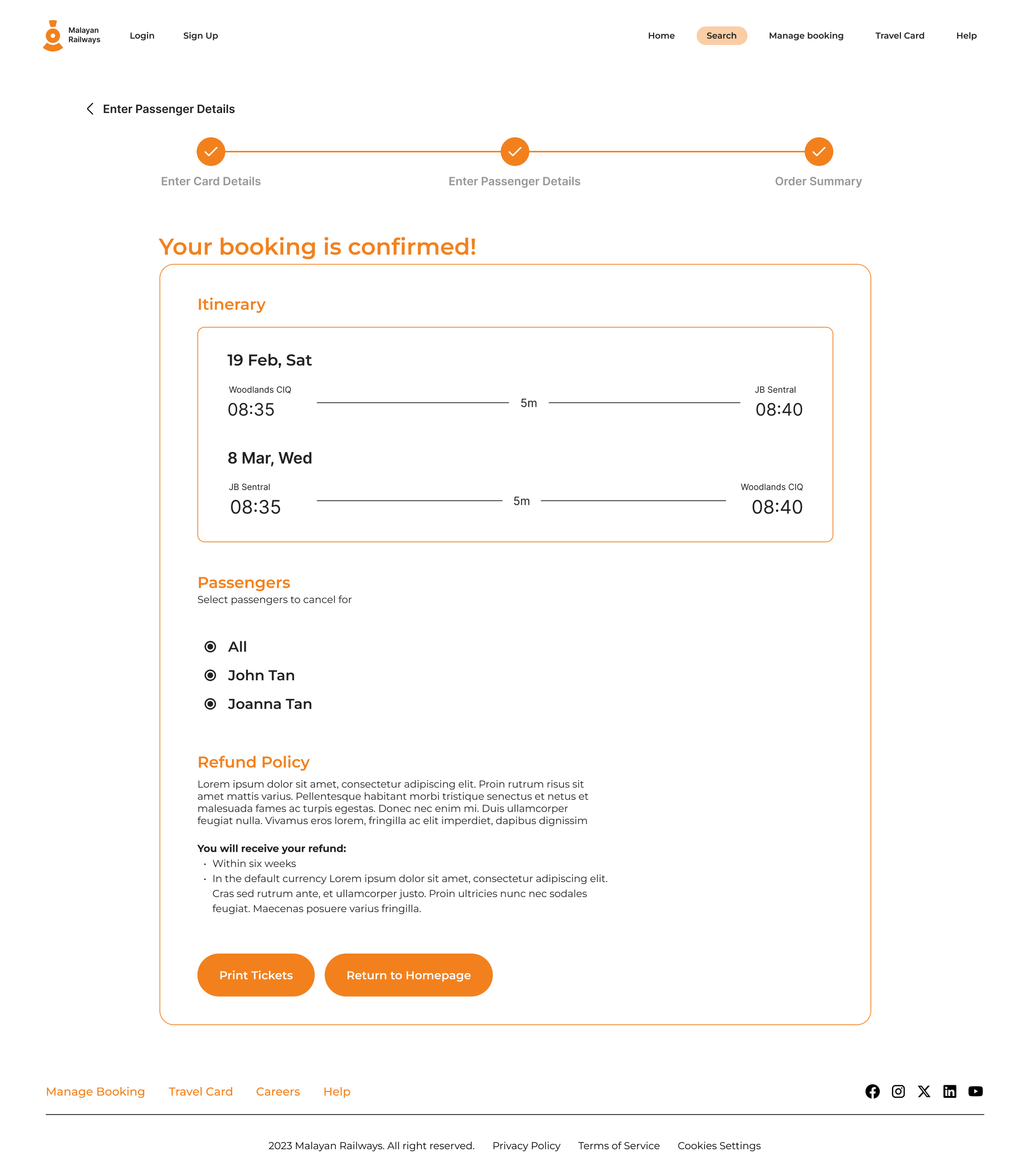
Provide assurance to users that their trip has been booked.
Before
“It would be helpful to have a text to tell me that my booking is confirmed.”
“I would also like to have a print booking button at my booking summary.”
After
Added copy to let users know that their booking is confirmed
and a “Print Booking button
Final Design